Form in Shadow
Concept
Private Residence
PROJECT TYPE
Residential
ΤΟΠΟΘΕΣΙΑ
Oraiokastro, Thessaloniki
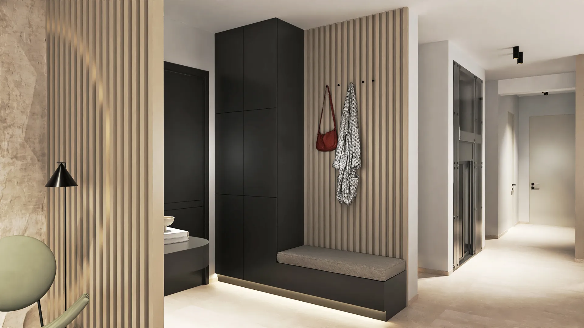
This home in Oraiokastro was designed around a simple idea: to make space feel calm without being empty, and warm without being decorative. The materials are quiet. The forms are clear. Each room is shaped by how light moves through it, how textures respond to touch, and how people live in it day to day.
There are no centrepieces, no visual tricks. Everything is meant to sit just below the surface of attention.
Living Area
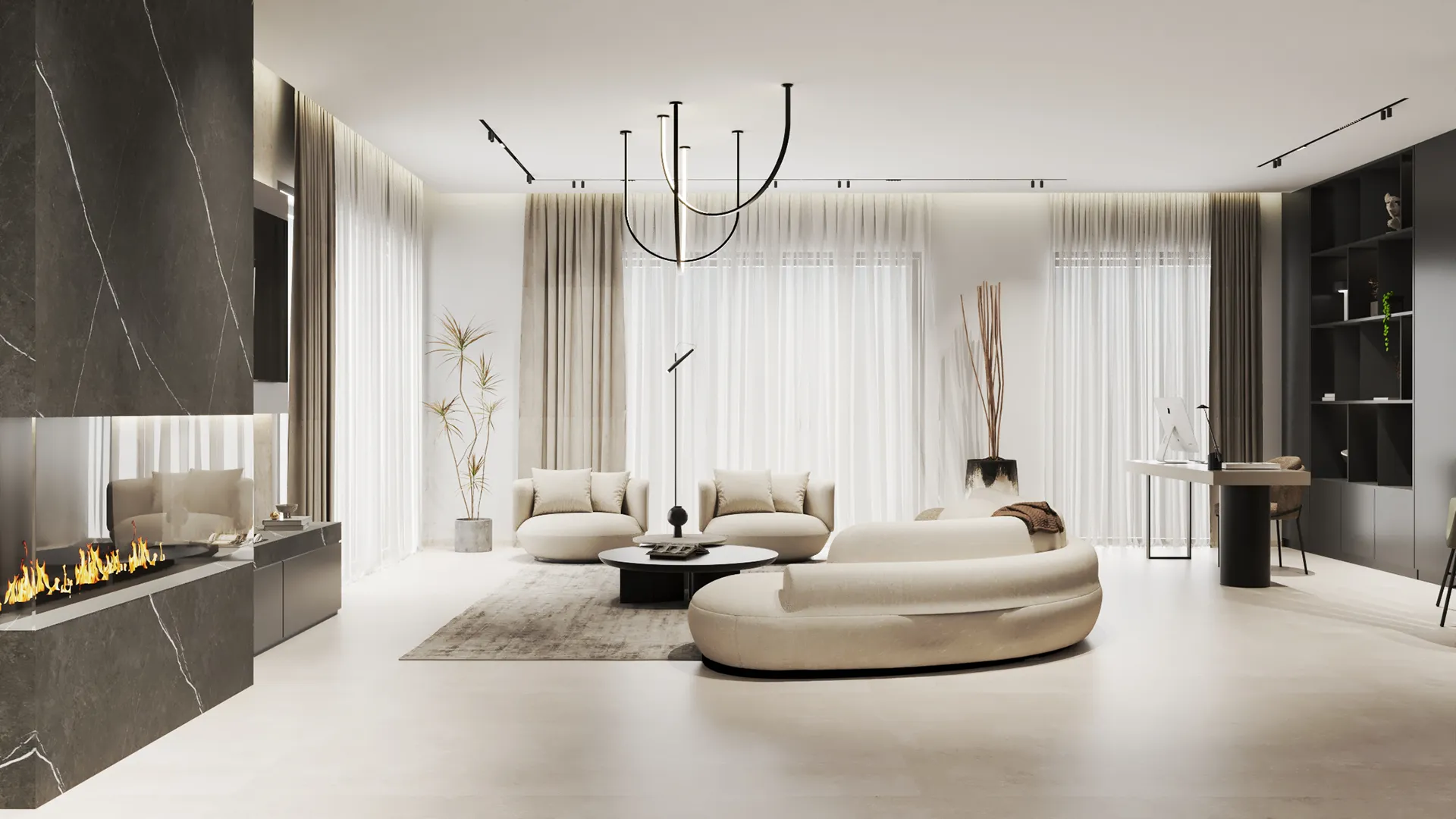
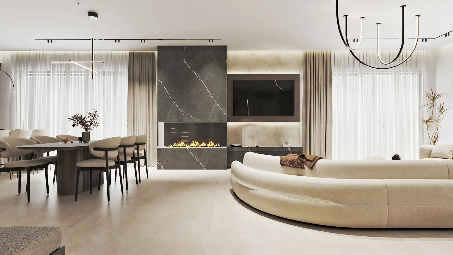
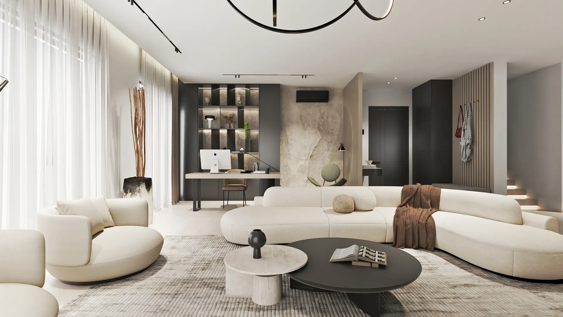
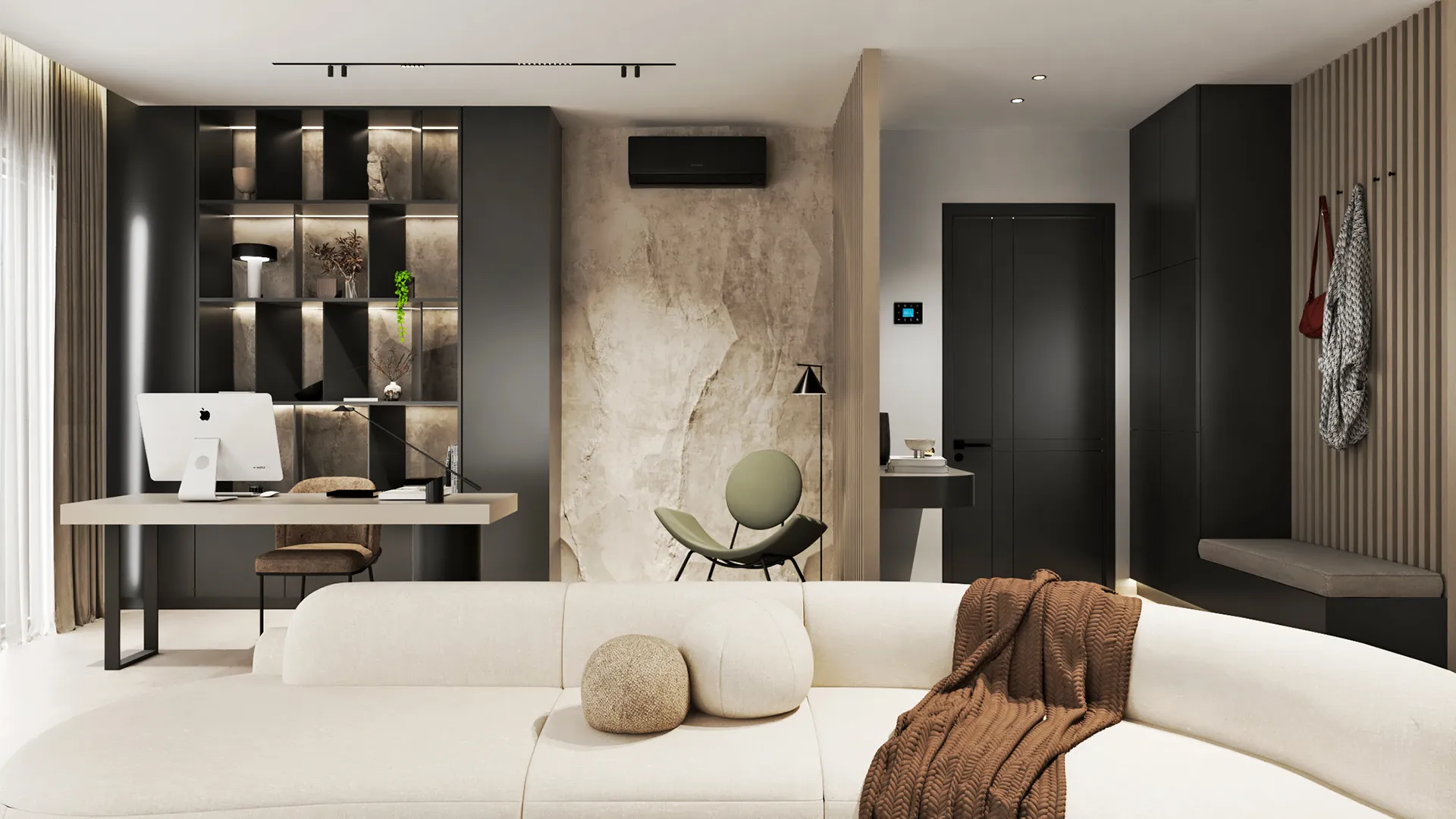
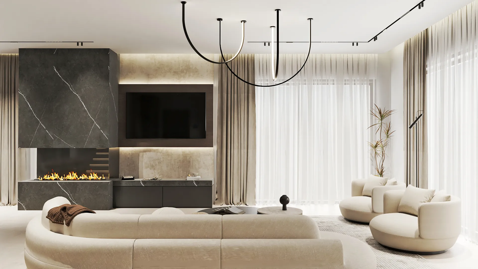
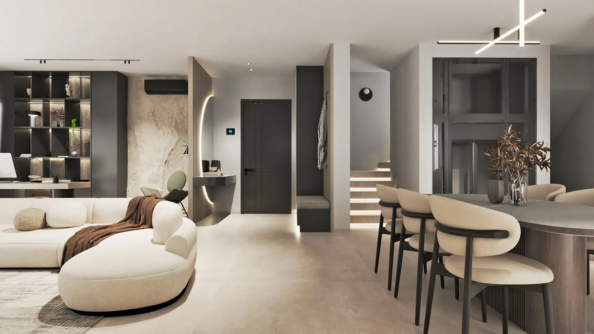
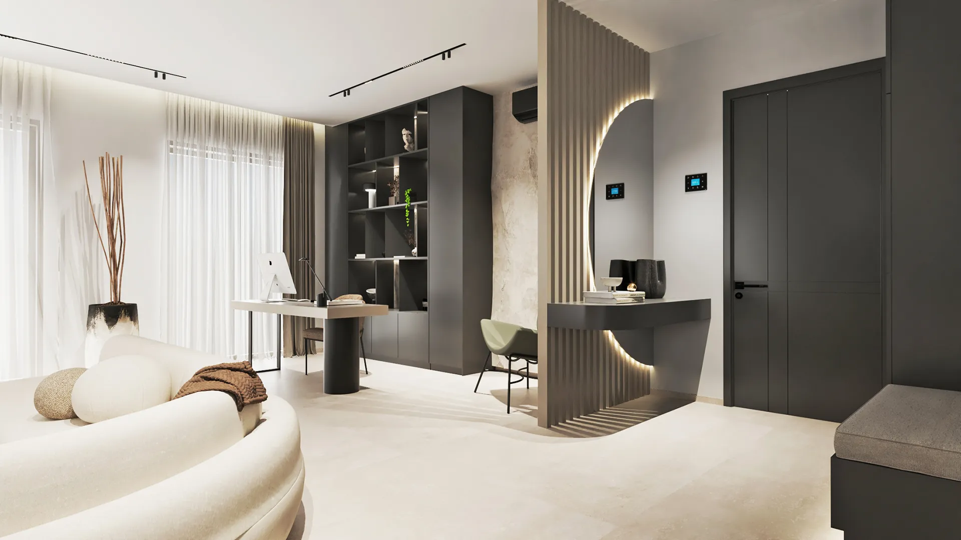
The living room is arranged with low furniture, heavy in volume but soft in tone. The palette is reduced to sand, pale stone, and muted browns, with occasional darker pieces grounding the composition. Shelving and cabinetry are built in and flush, allowing the perimeter of the room to breathe. Lighting comes from a combination of ceiling spots and indirect sources, with nothing overly bright or central.
Kitchen
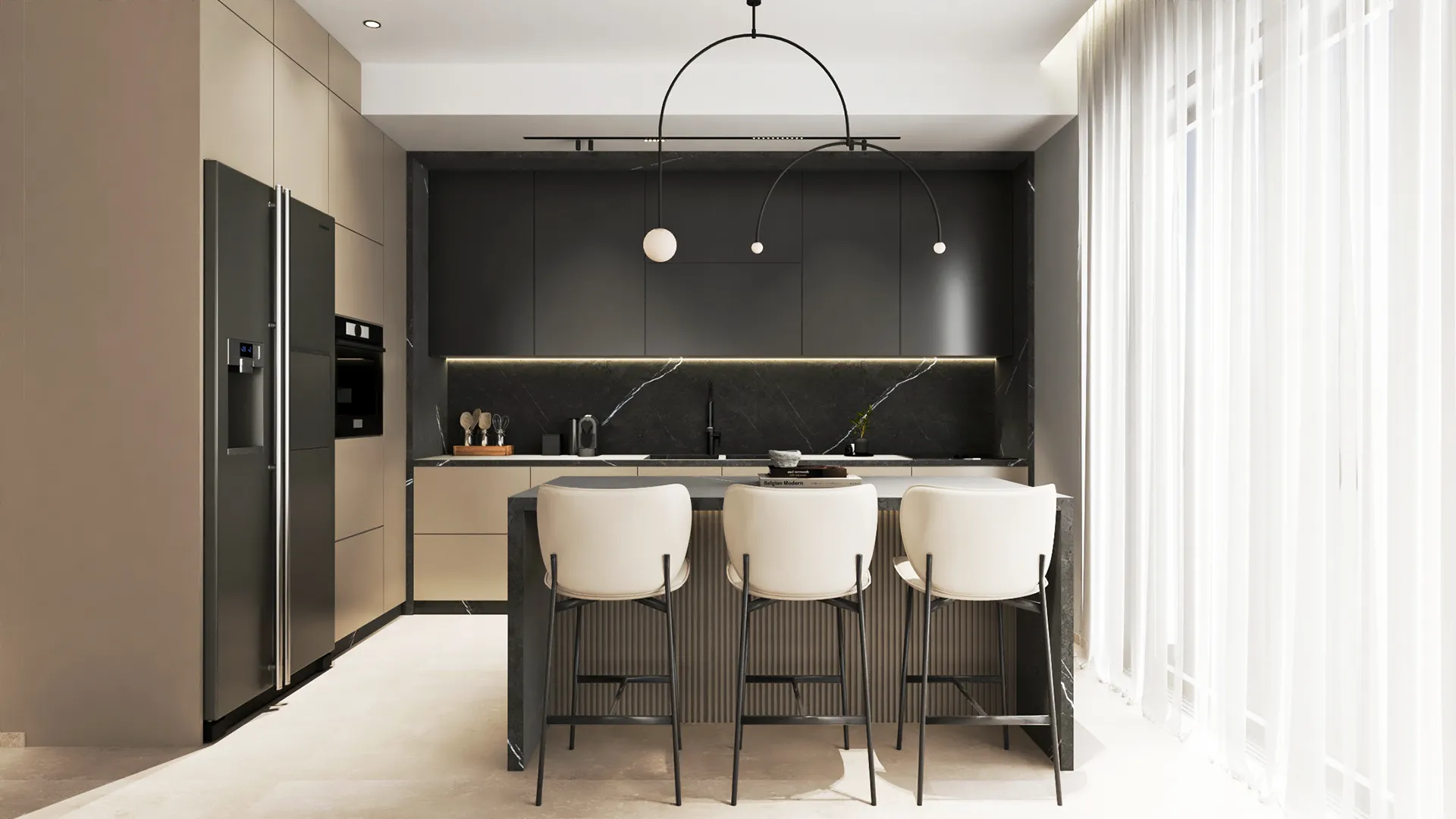
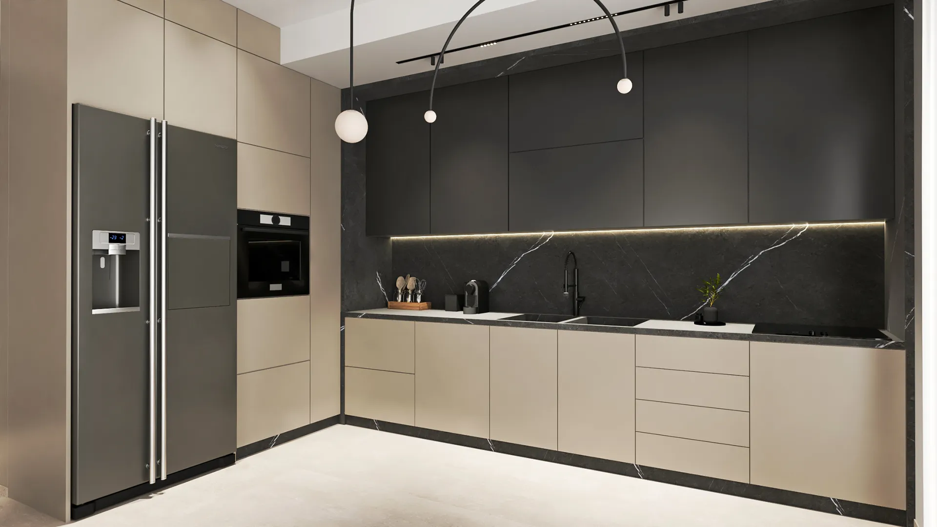
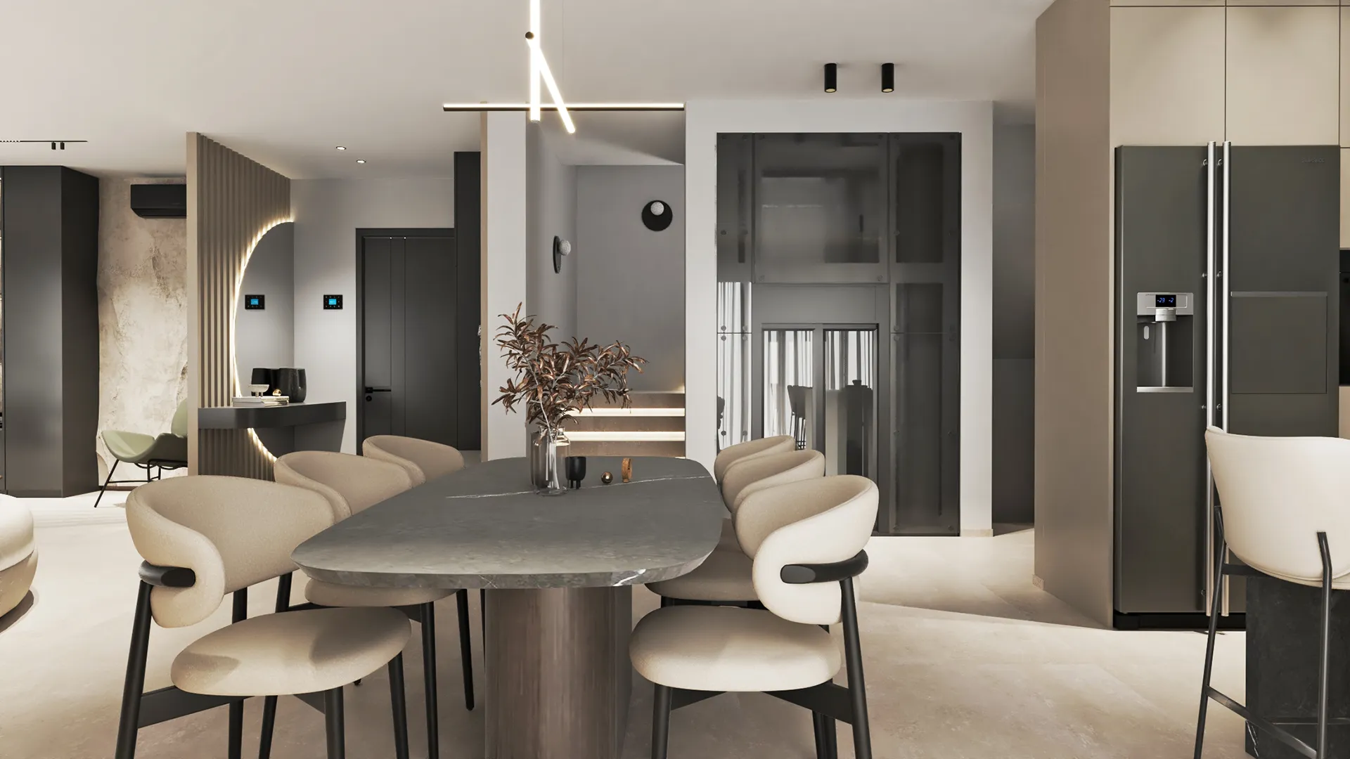
The kitchen is treated as part of the architecture, not a separate zone. The island has a broad, sculpted base that gives it weight. Surfaces are matte and neutral, continuing the material language of the rest of the home. Storage is fully integrated. Small shifts in shadow — around the base of cabinets or under the island — bring the form into focus without the need for contrast or colour.
Bedrooms
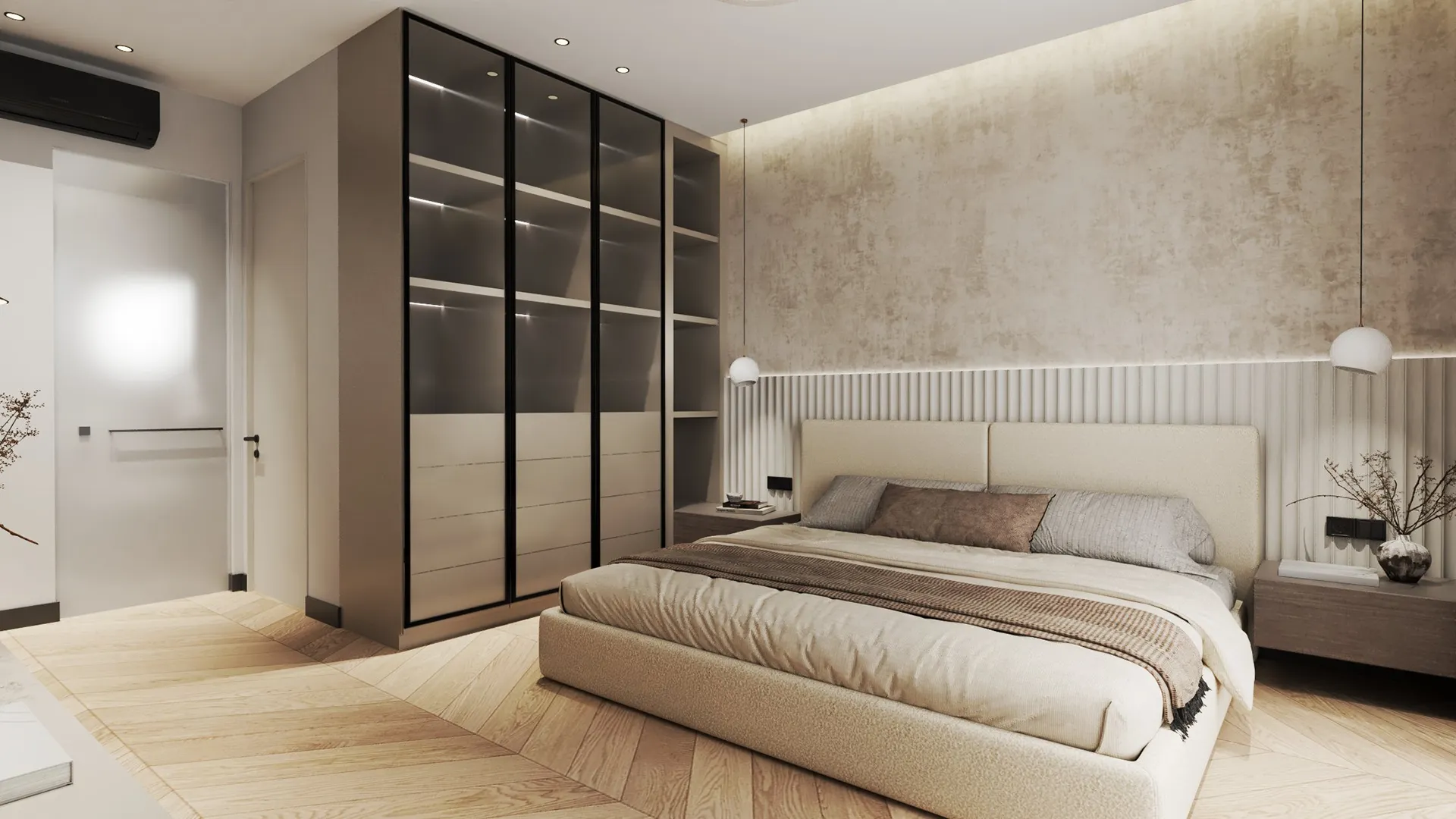
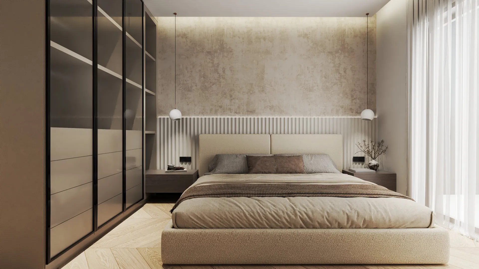
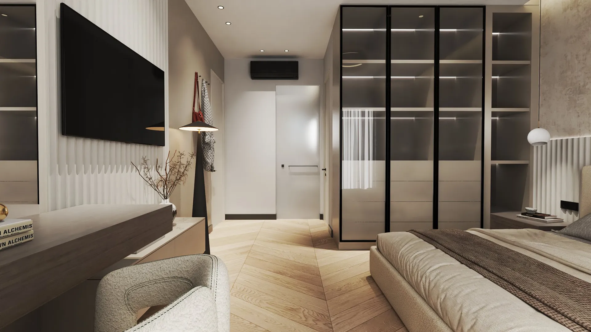
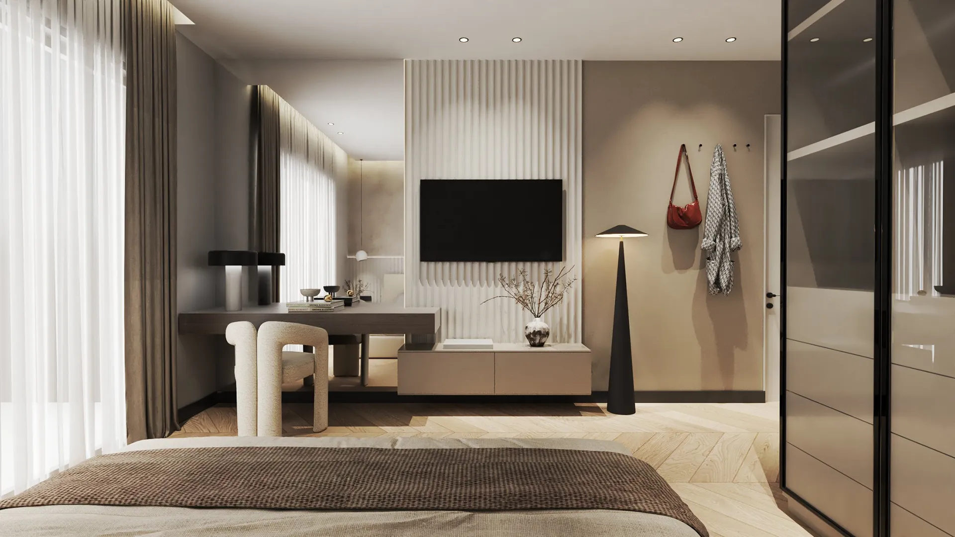
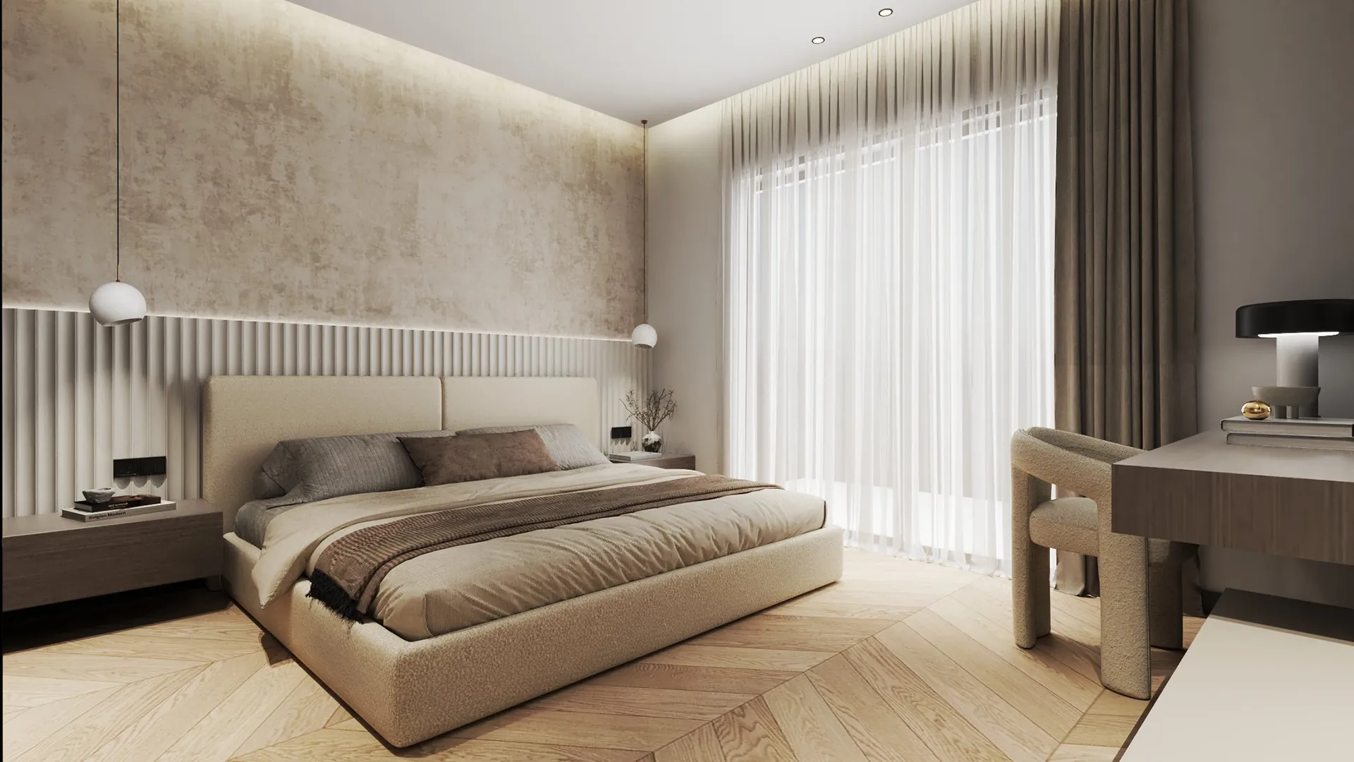
The main bedroom avoids any symmetry or ornament. The headboard is wide and upholstered, giving the wall a softer edge. Beside tables are minimal, almost floating. Large wardrobes disappear into the wall, finished in a tone close to the paint. A single curtain filters light along the length of the room, keeping the mood even from day to night.
Bathrooms
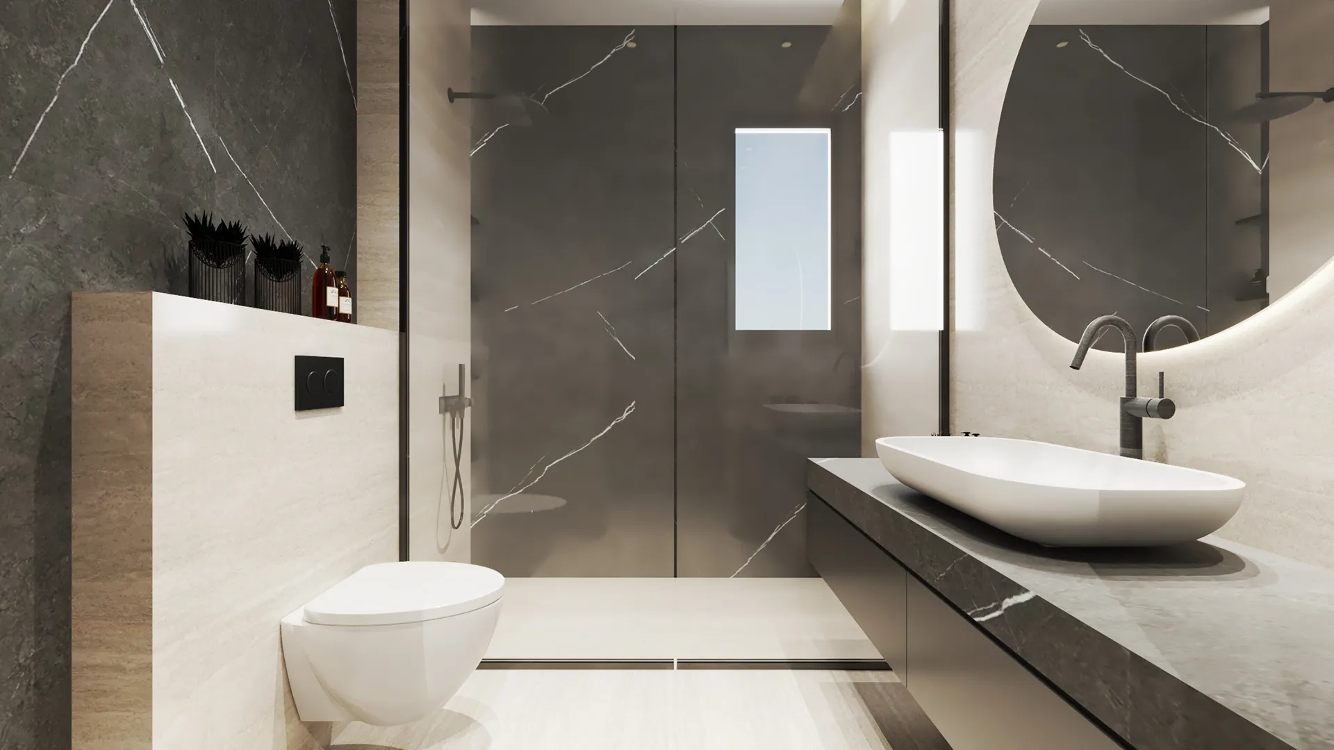
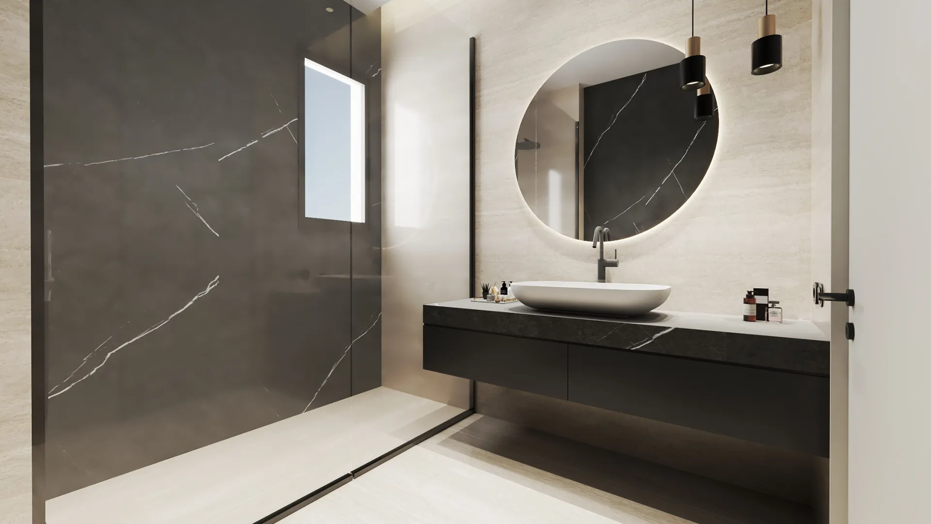
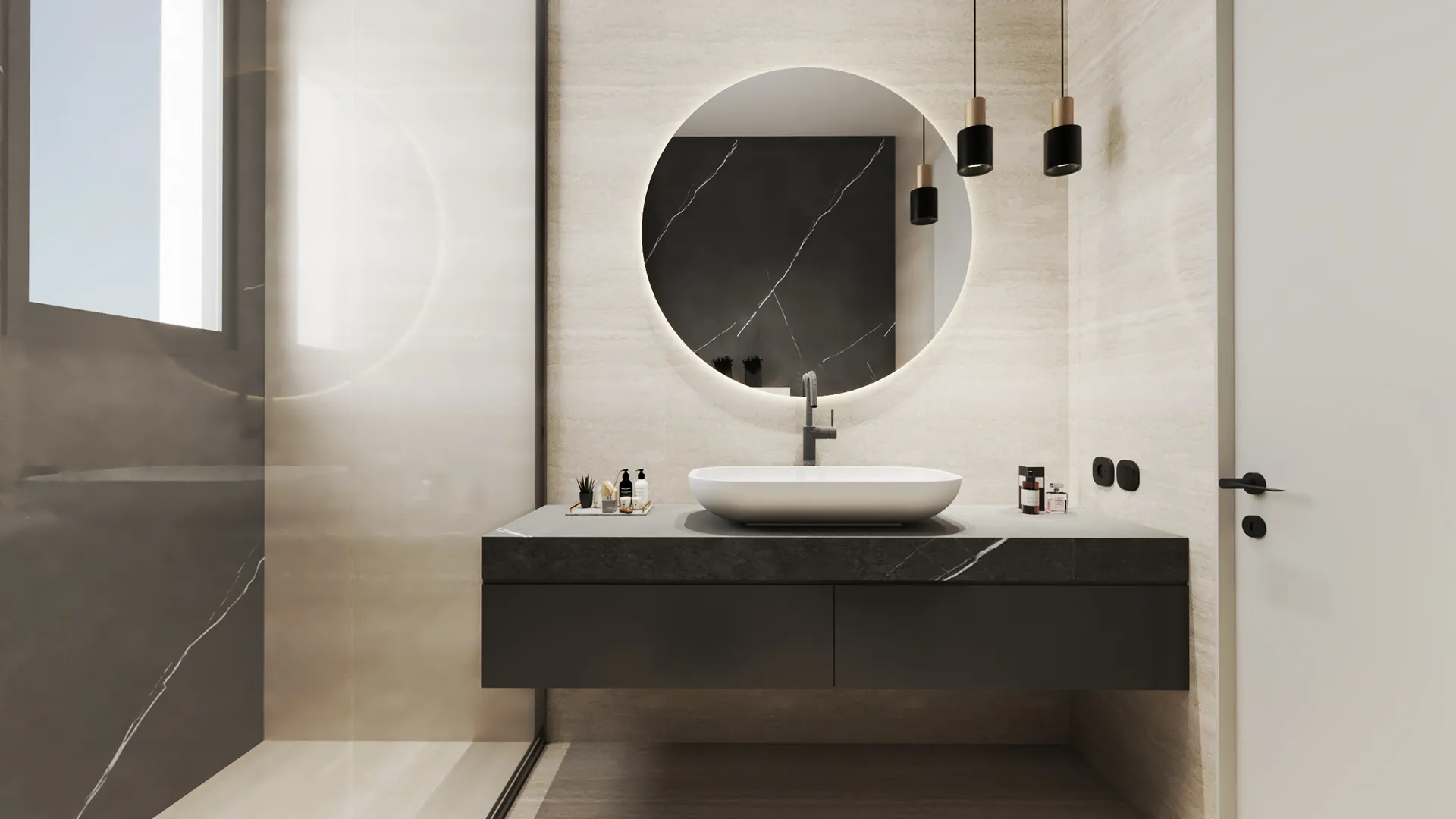
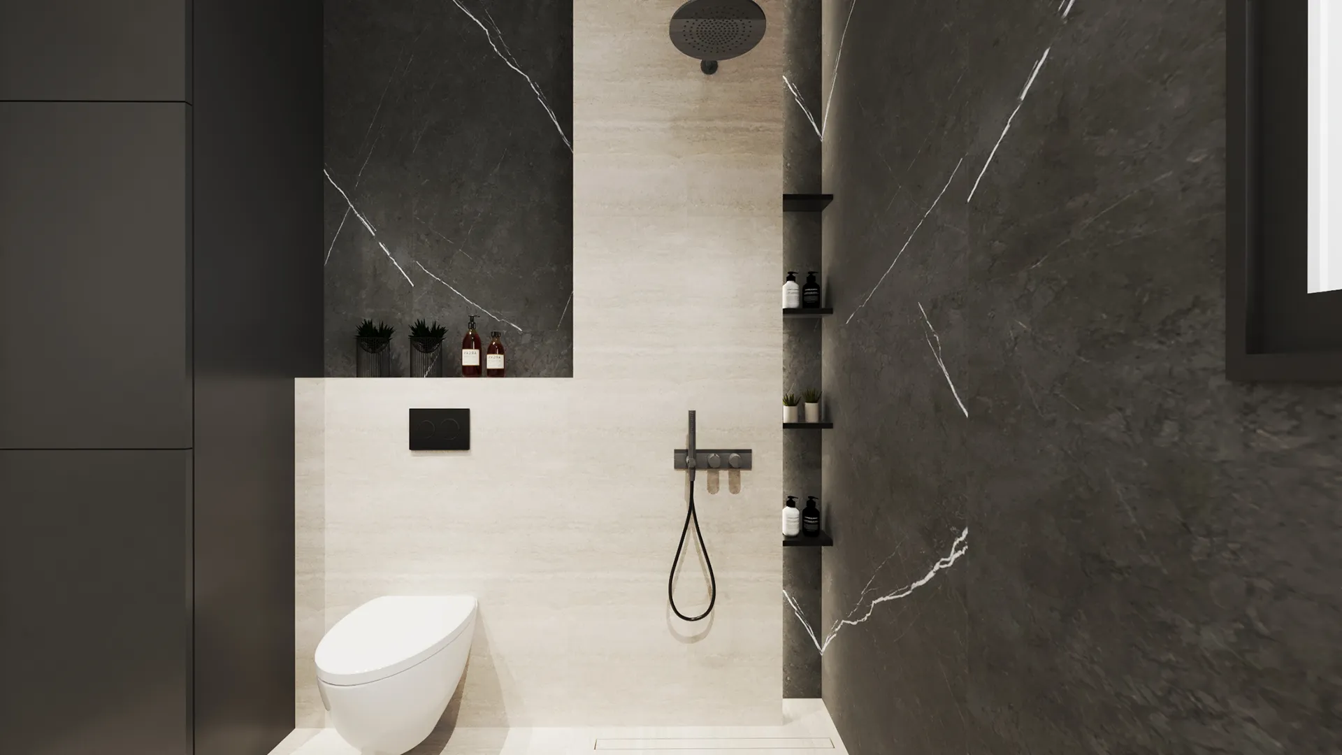
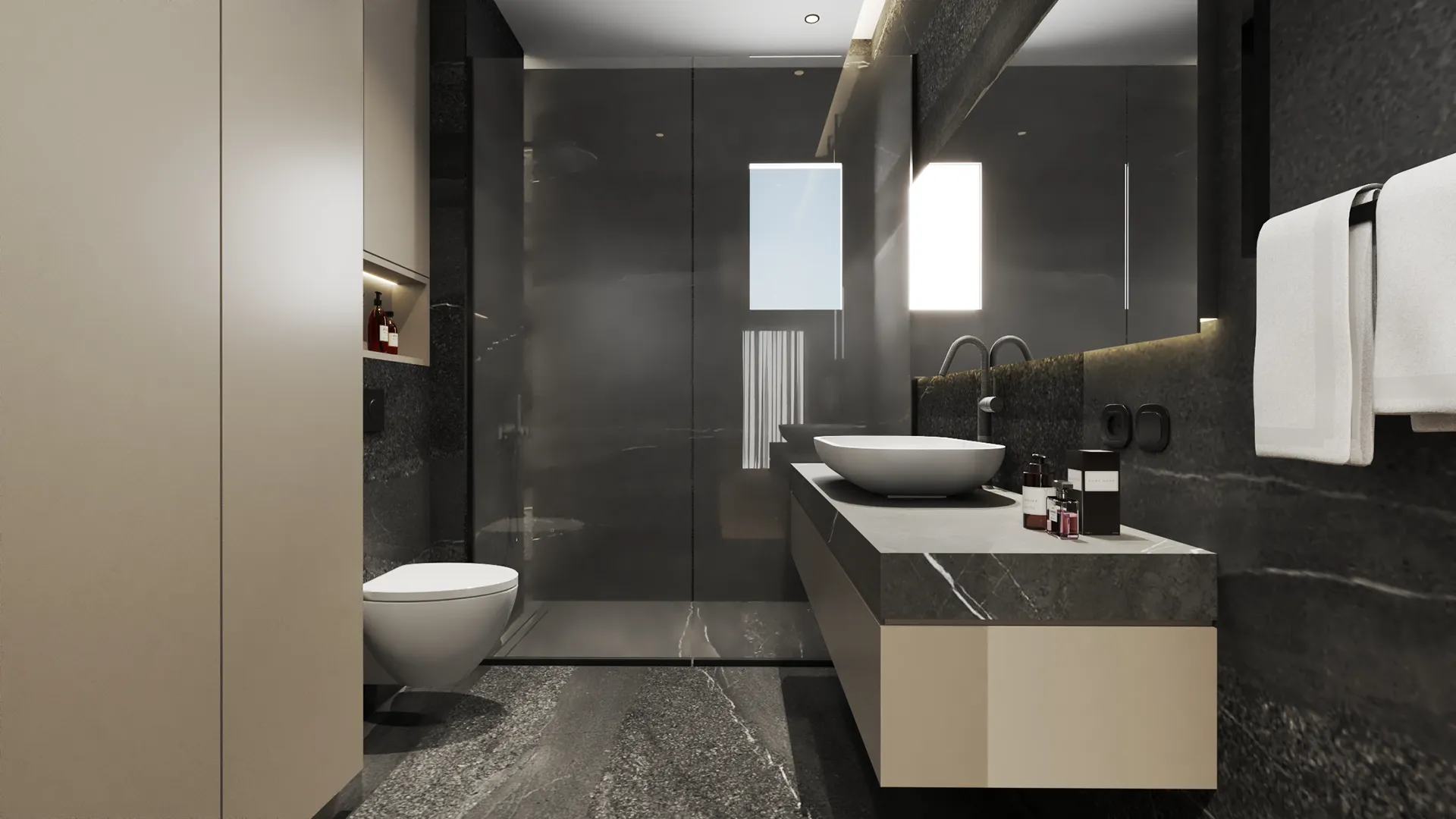
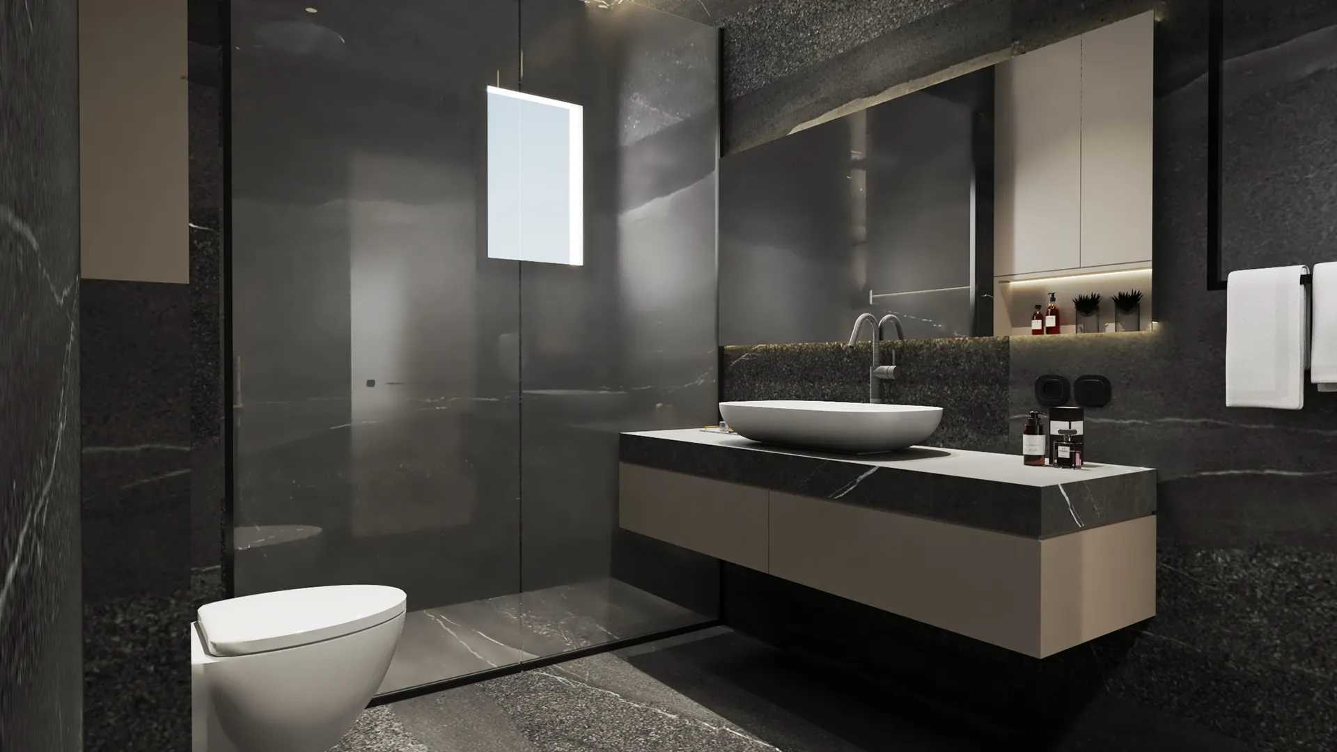
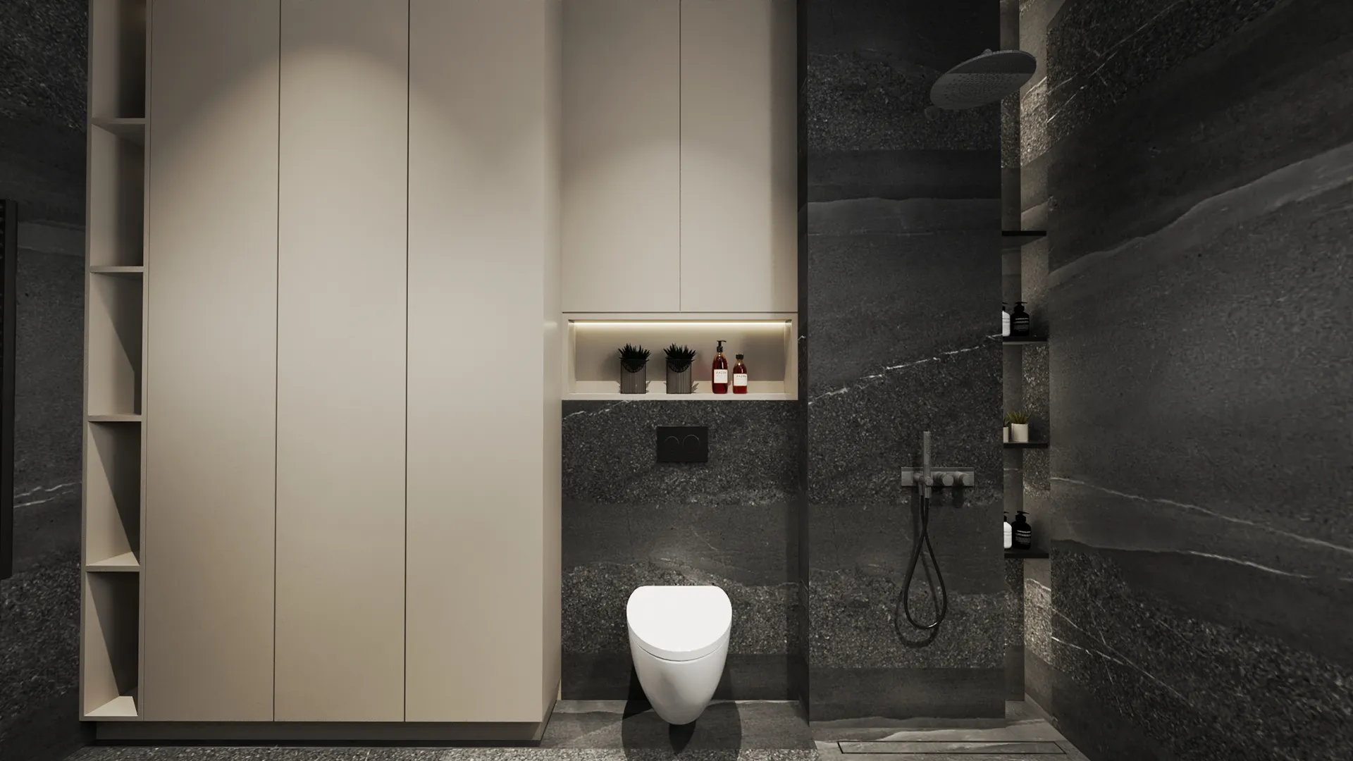
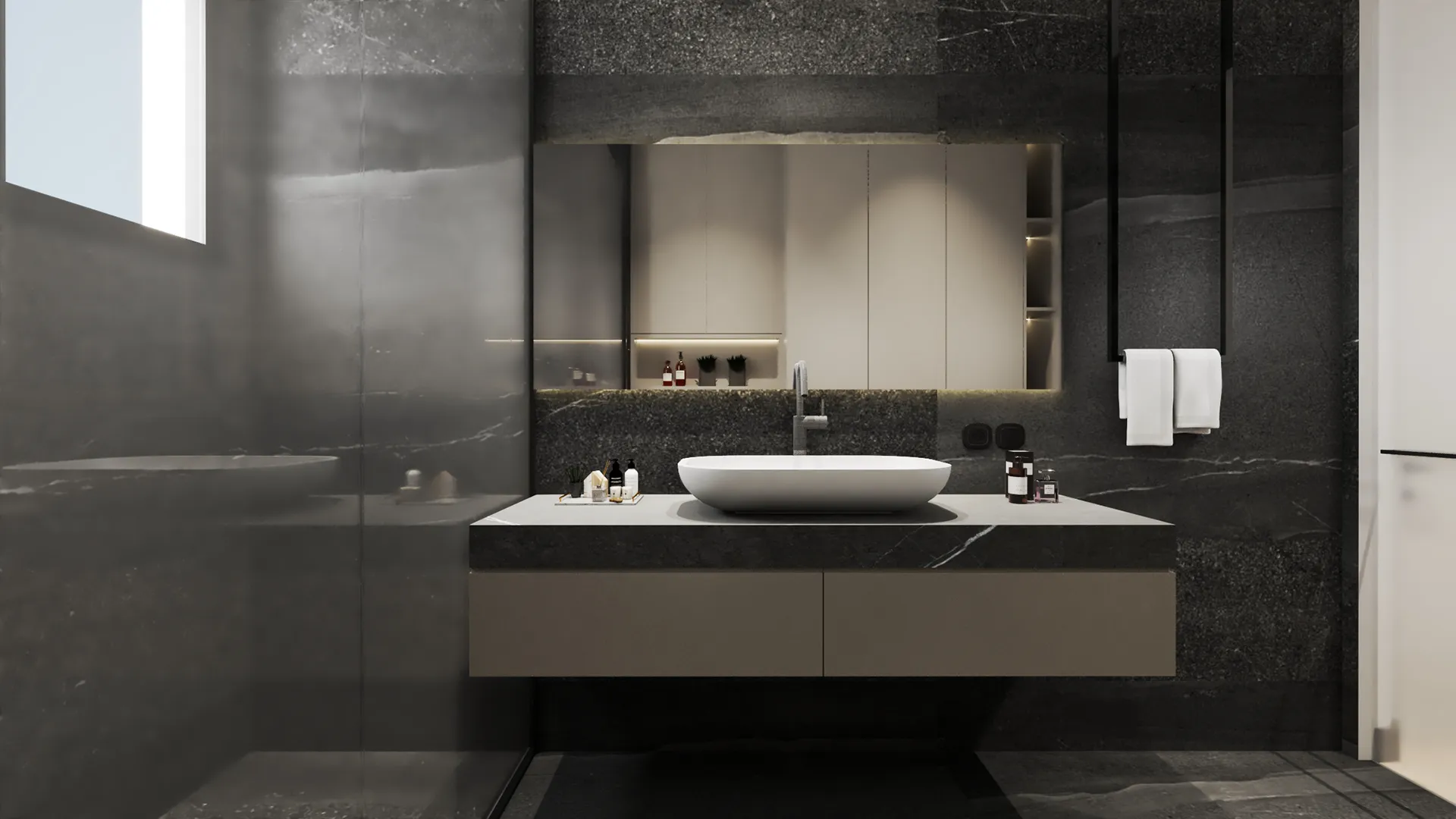
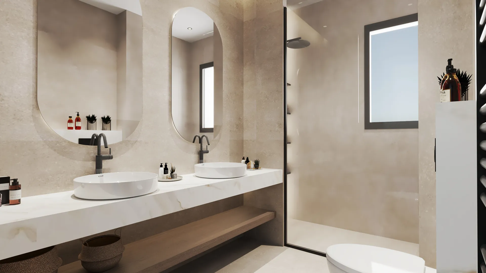
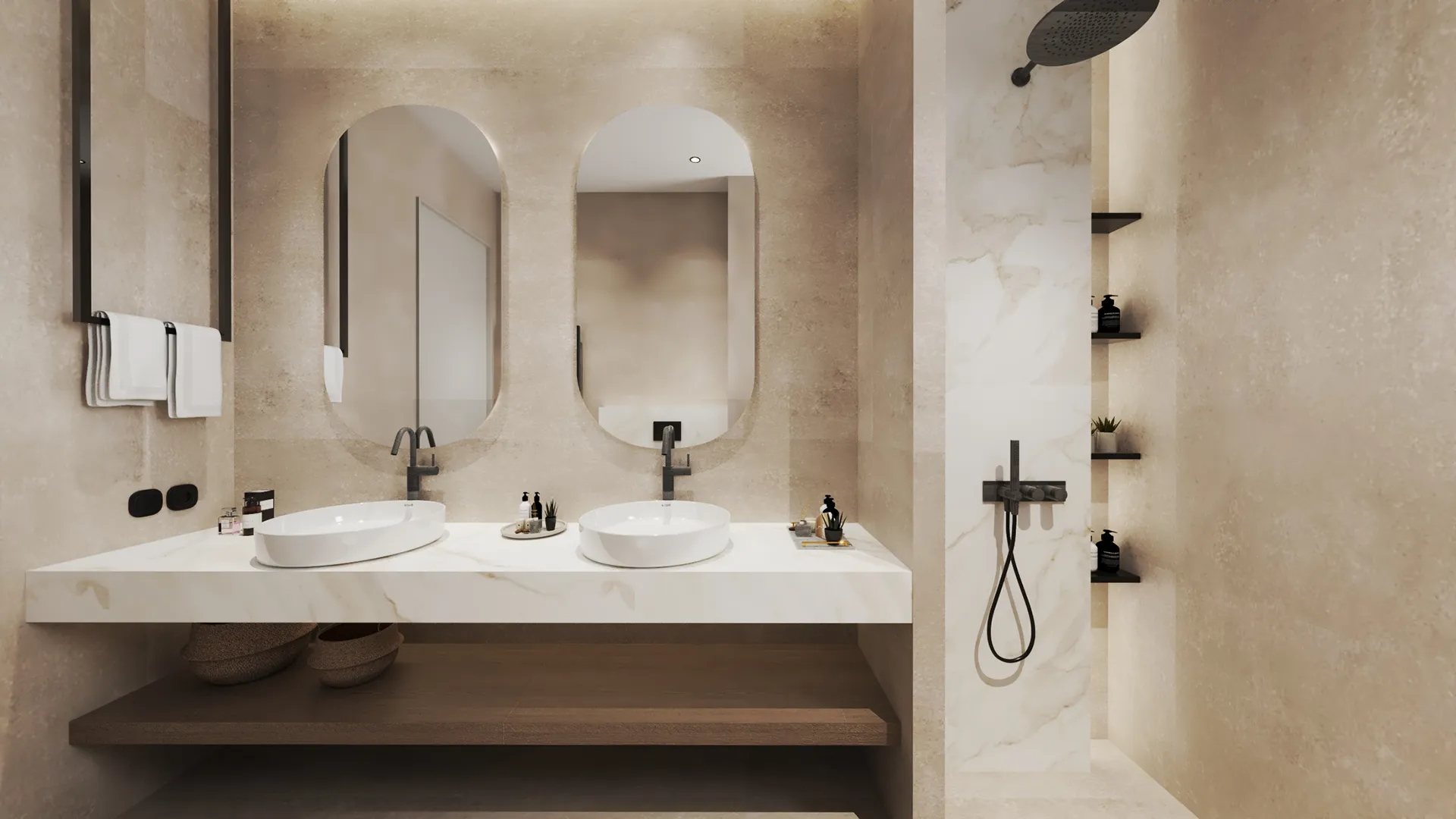
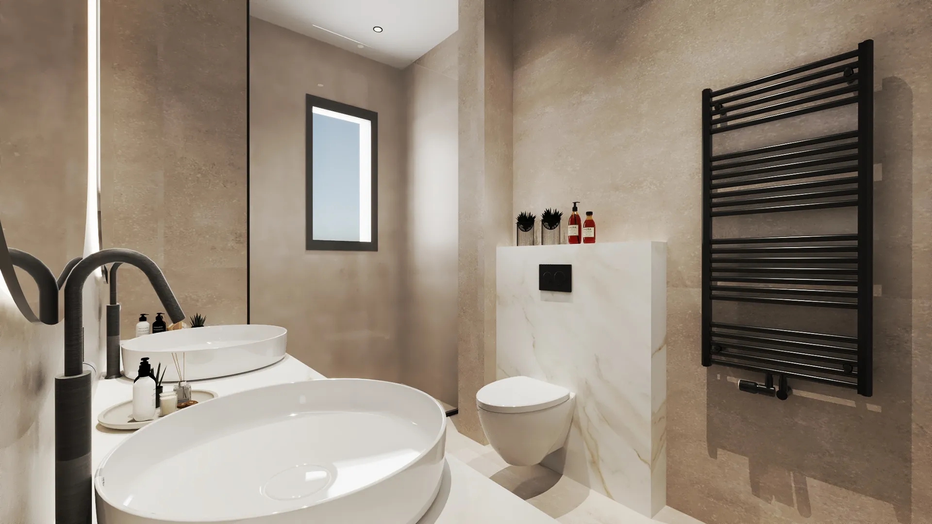
Bathrooms use fewer materials and softer lines. Basins sit on thick slabs. Mirrors are rounded at the corners. Built-in niches replace any need for fittings or clutter. The colours stay close to beige, ivory, and pale grey. Lighting is mostly indirect — tucked above mirrors or beneath counters — giving each room a muted, even glow.
Children’s Bedrooms
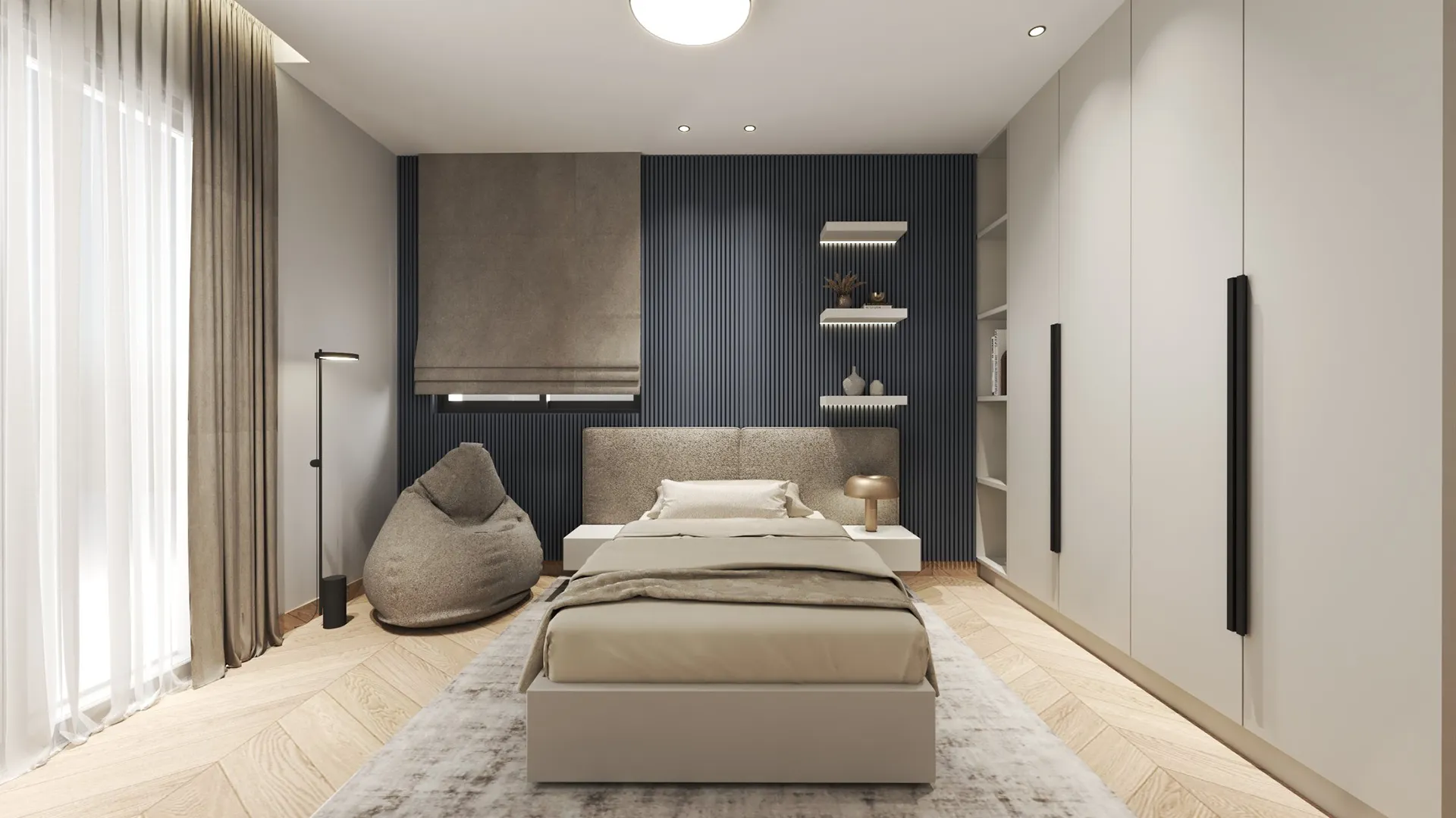
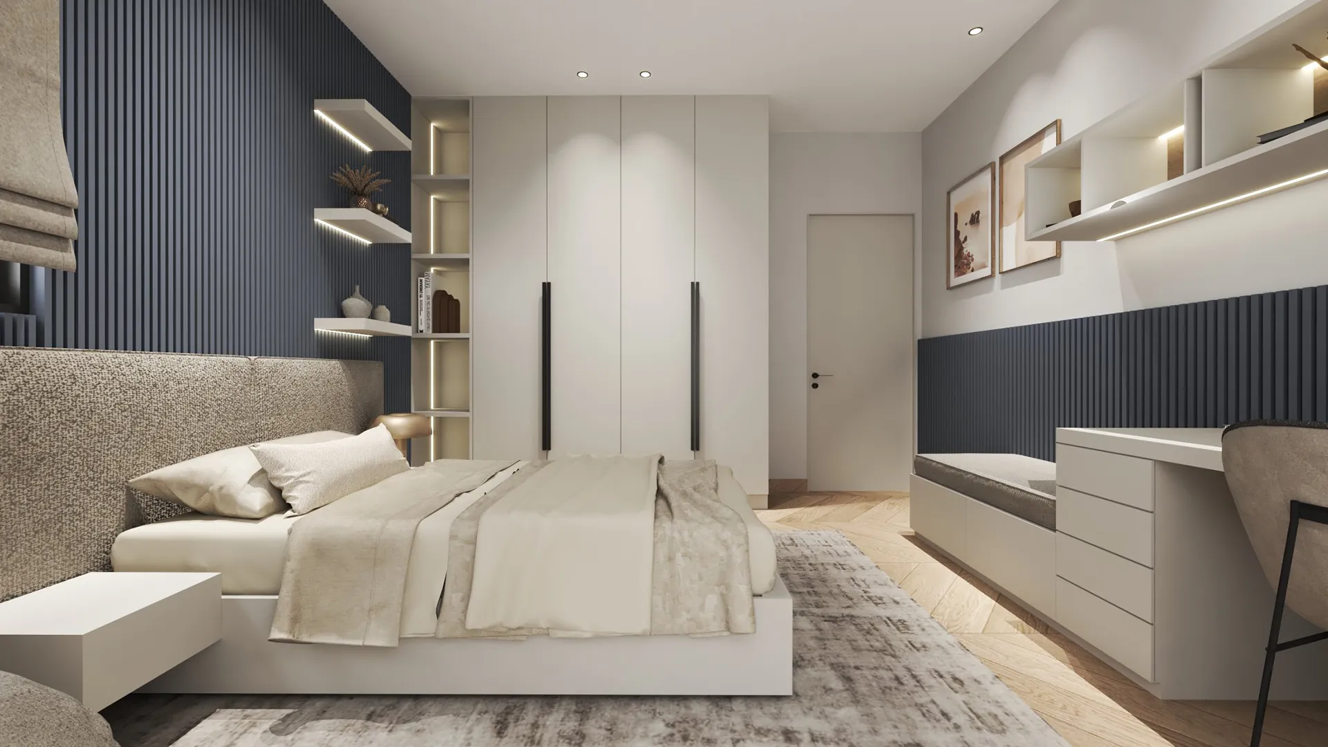
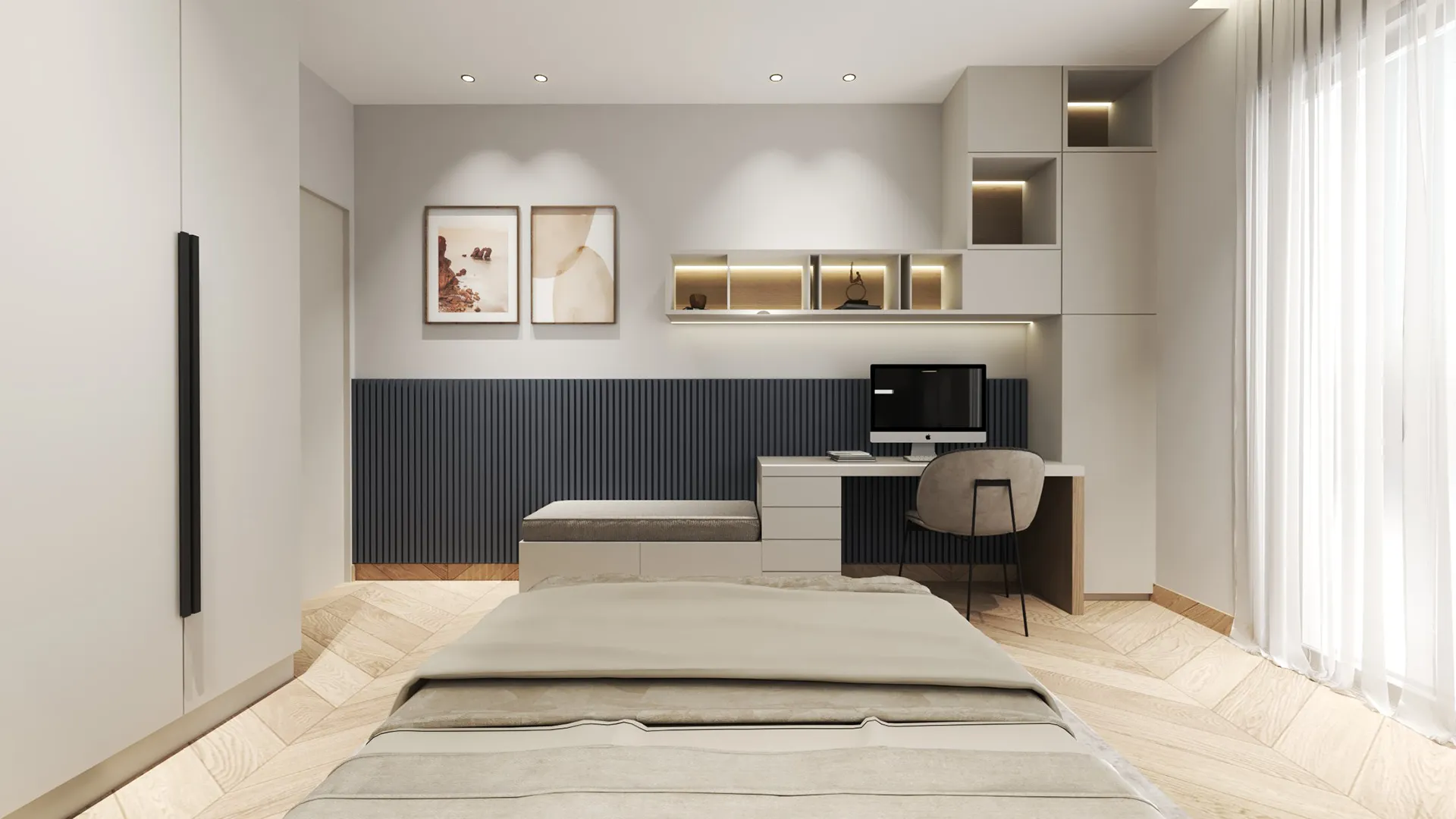
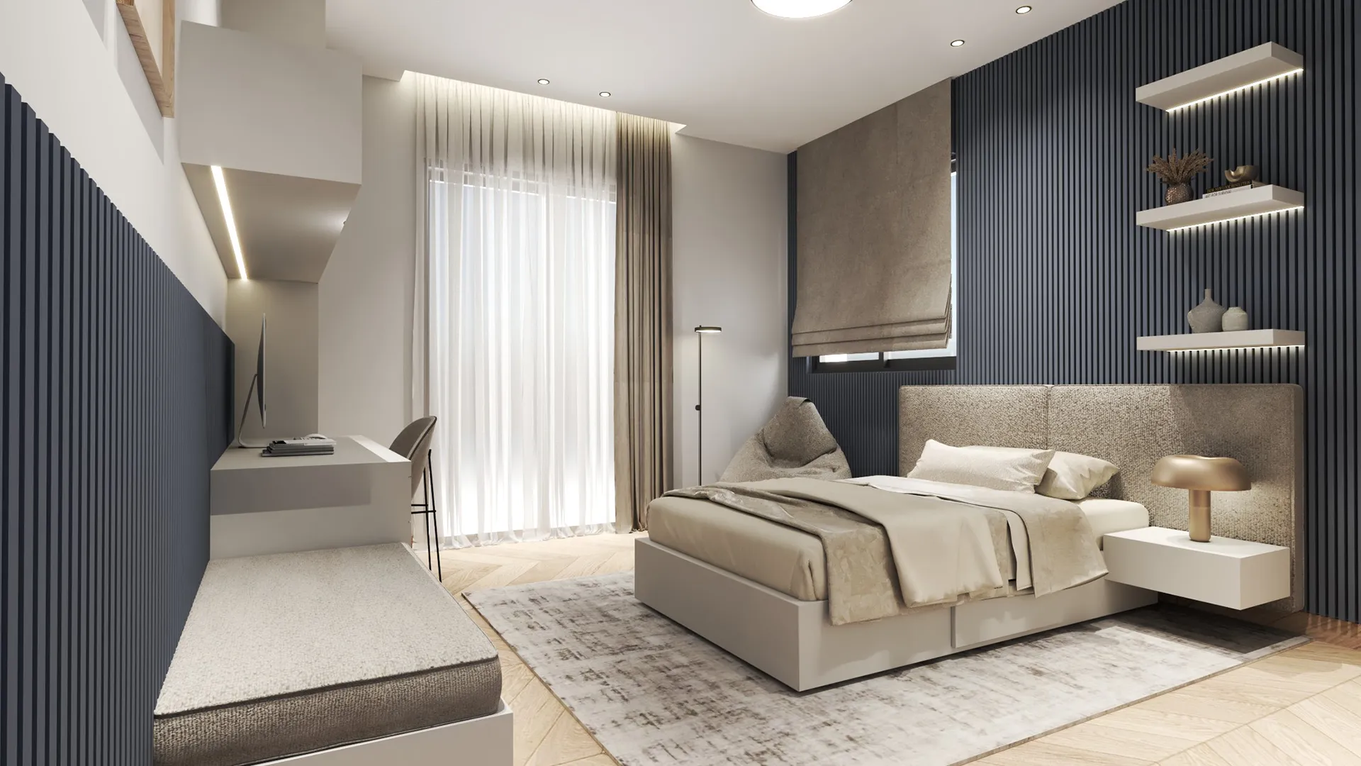
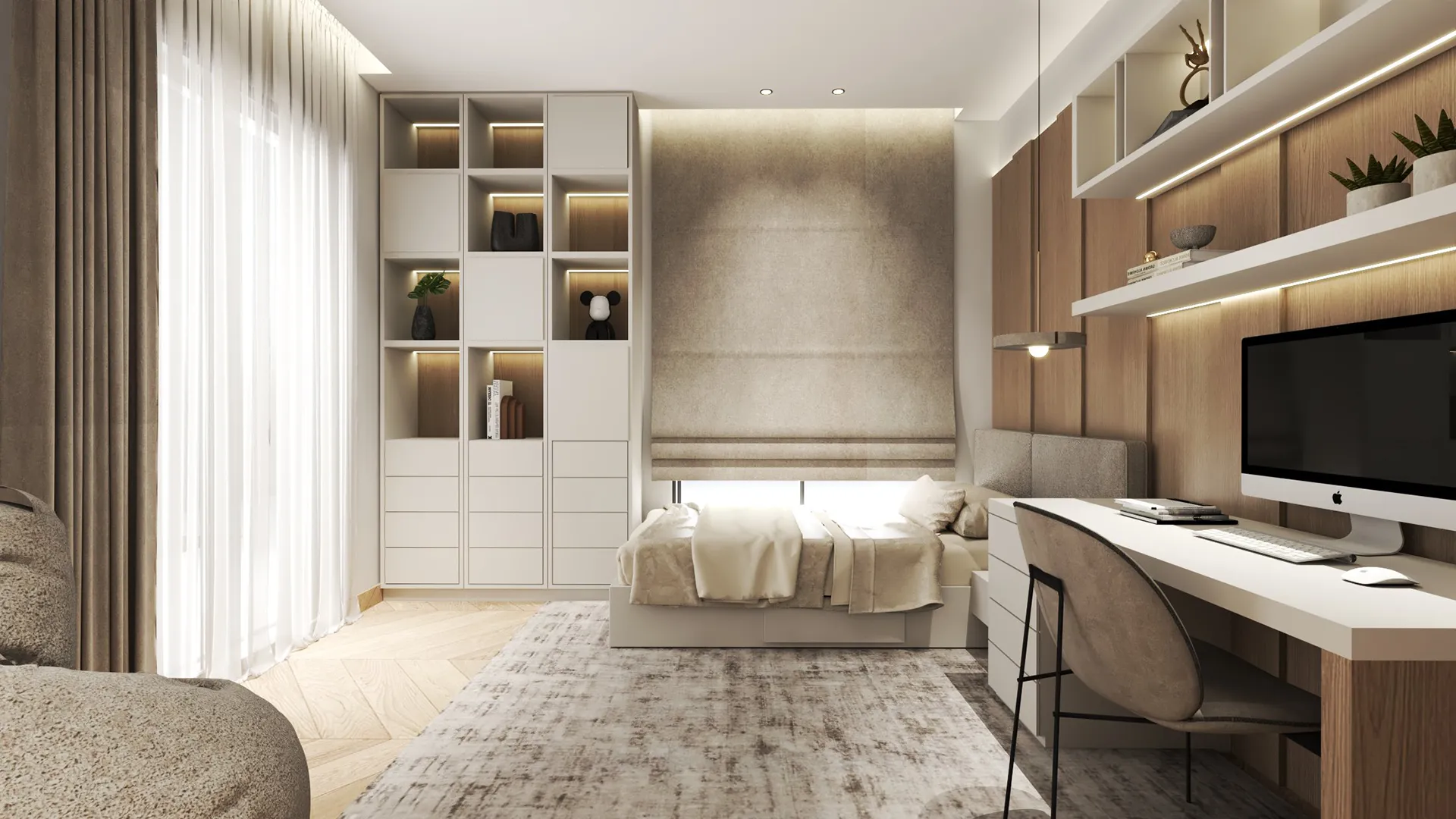
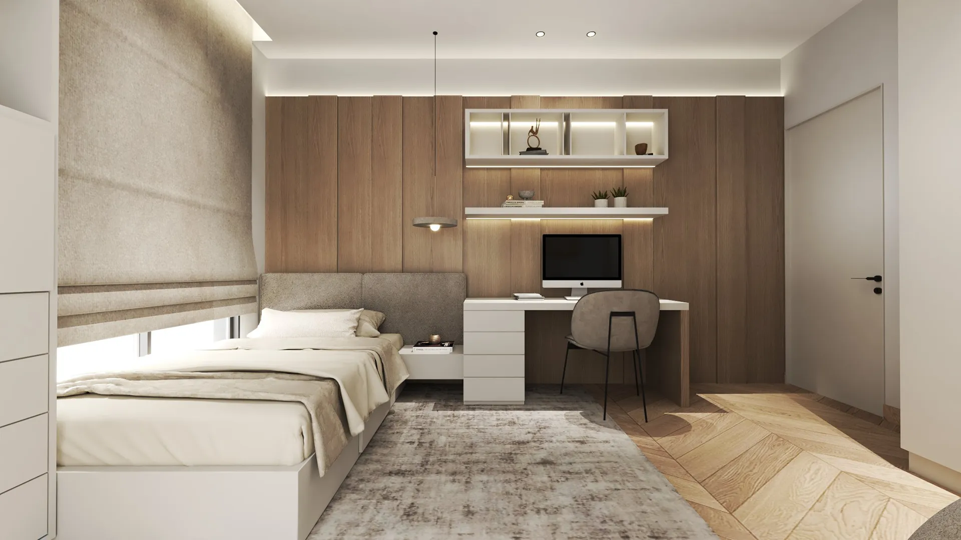
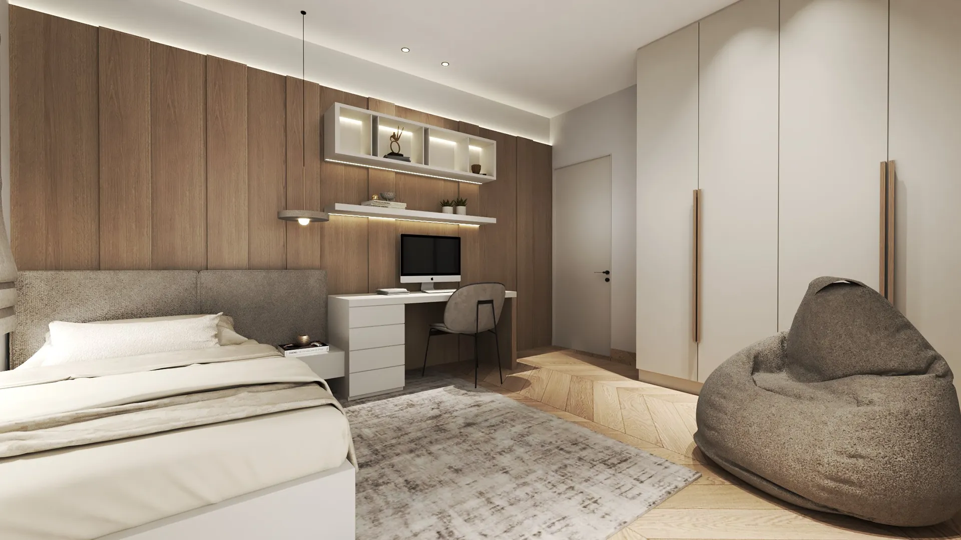
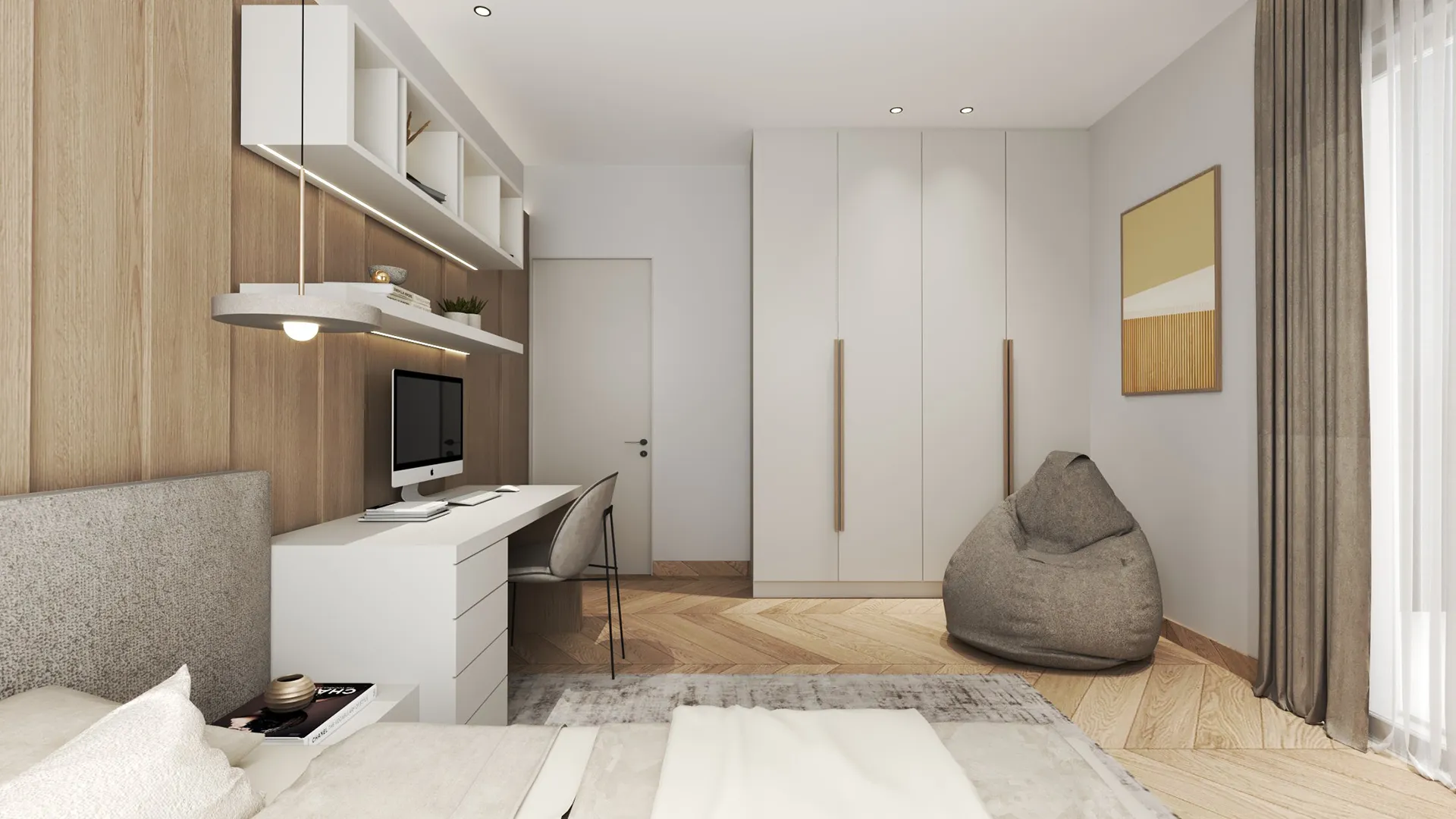
Each of the children’s rooms has its own tone. One uses dark vertical panelling behind the bed, broken up by white shelving. The other uses warm timber slats along the wall and above the desk. Both rooms include built-in storage, study areas, and upholstered seating. They are designed to feel calm, open, and adaptable — not themed or fixed to a particular age. Every piece has a clear function and sits quietly in the room.
Form in Shadow is not about visual impact. It’s about reducing decisions to what matters, and letting the rest fall away. The result is a home that doesn’t try to impress — it simply works, with ease and consistency, from one room to the next.
